
Waymo's California Growth May Be Slowing, But It's Complicated
Disentangling ridership from the bumps along the road

Today’s post comes from Dr. Matthew Raifman, a transportation researcher at UC Berkeley who studies how automated vehicle systems impact safety, sustainability, and urban mobility. He also writes about autonomous vehicles, transportation policy, and urban mobility at Curves Ahead. He offers this analysis in a personal capacity and his title is used for the purpose of identification only.
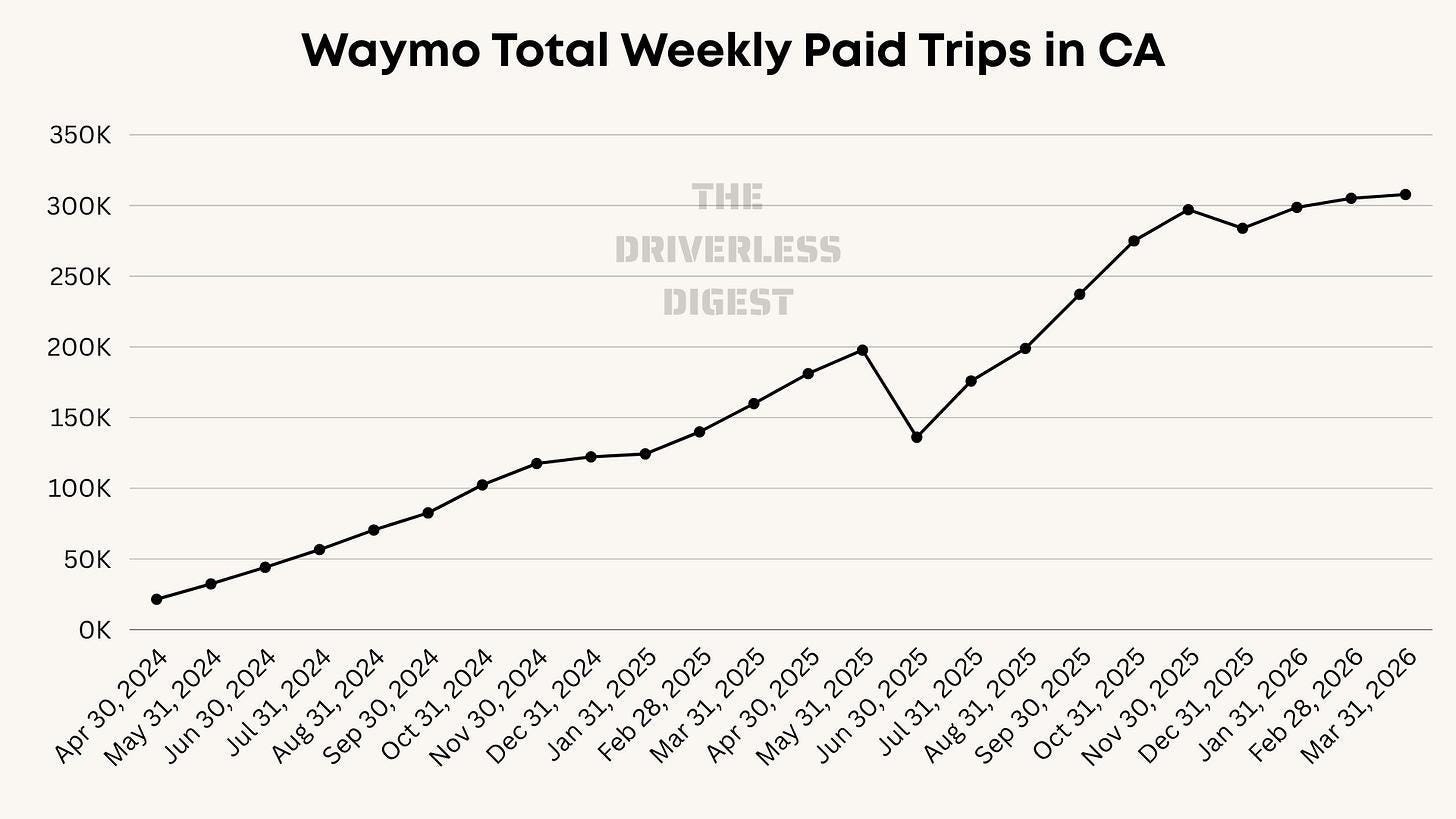
Recently, Harry had an interesting piece exploring whether Waymo’s growth in California might be slowing with some interesting theories on why. If you look at a chart from that article, it sure looks like there has been a plateau in ride growth in 2026 after an accelerated growth pattern in the second half of 2025. Today, I thought I’d do some regression analysis and see if we can tease out what Waymo’s growth might have been without all those exogenous shocks.
TLDR: After adjustment, Waymo’s trip growth does appear to be decelerating, but it doesn’t look like that is driven by supply. Rather, it might be that people are using Waymo differently in California and taking longer trips.
A rollercoaster of a road
A lot of things happened in Waymo World over the last two years. More than 180,000 Angelenos evacuated due to wildfire risk at the start of the year 2025. Five Waymo vehicles were burned in the June 2025 in anti-ICE protests in Los Angeles and Waymo paused service in parts of LA and San Francisco in response. And then there was December 2026 when San Francisco had two distinct service disruptions in a single month: a PG&E substation fire that knocked out power across a third of the city, and a flash flood pause on Christmas Day (Waymo issued a recall recently to fix this issue but the implications of that recall won’t show up until the next quarter of data is released). Over the same period, the Waymo service zone roughly quintupled in size, with the Peninsula south of San Francisco coming online in stages. Freeway service launched in November with San Jose airport launched the same day. SFO service launched in late January 2026.
How do we tease out Waymo’s growth from the noise?
The bumps in Waymo’s California trip curve come from two different sources. Some are things Waymo itself chose to do (expansions, fleet increases…); others are from things that happened to Waymo (riots, fires, PG&E). We want to include Waymo’s choices in the chart but exclude the exogenous effects. The approach is straightforward. We fit a smooth growth trajectory to the months that weren’t disrupted by external events, then compare the disrupted months against where the trajectory says they should have landed. A quartic polynomial does this nicely, since it can capture both the rapid early growth and the gradual flattening as the service matures. There are limitations of course, generally due to lack of data, but let’s see what we can do.
Disentangling the Waymo trip data from exogenous shocks
The black line below is what actually happened. The red line is the best-fit trajectory, drawn through the 18 months that weren’t externally disrupted. The hollow circles mark the affected months, which are excluded from the fit and shown against where the trajectory says they should have been.
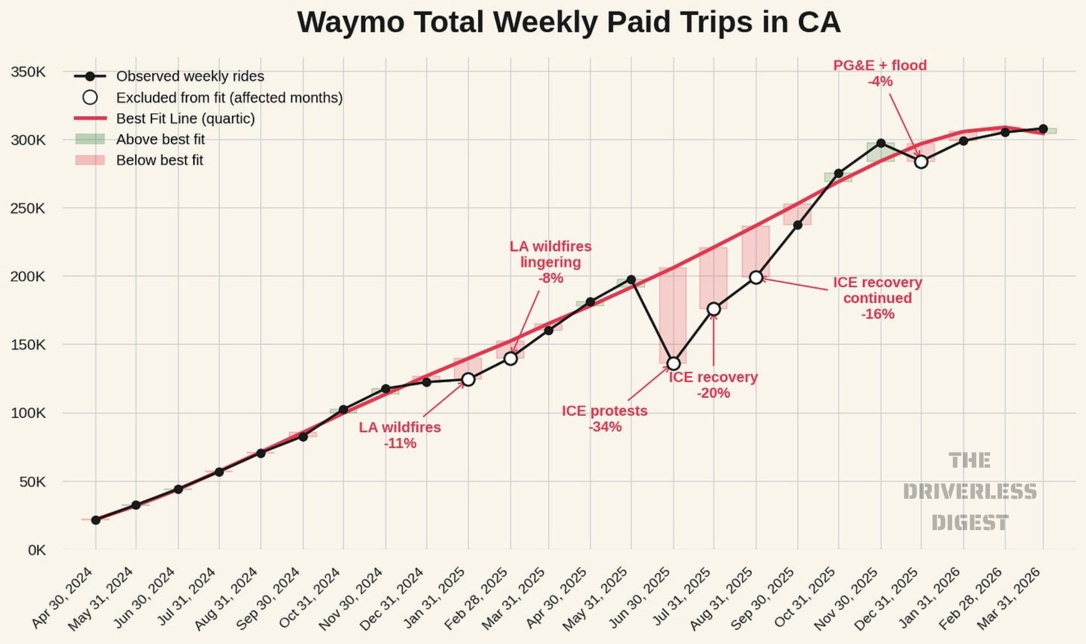
For most of the period, the actual data sits right on top of the trajectory. The fit threads through the clean months almost mechanically, which tells us Waymo’s California growth has followed a remarkably smooth S-curve from April 2024 onward: rapid acceleration through 2024 and the first half of 2025, an inflection in mid-2025, and gradual flattening through Q1 2026 as the service matures.
The excluded months tell us how much the external events cost Waymo. The January 2025 Palisades and Eaton fires drove ridership 11% below trajectory, with a lingering 8% depression in February as evacuations stretched on and air quality stayed bad. The June 2025 ICE protests were the largest single shock at 34 % below trajectory. Recovery from ICE was slower than one might have guessed: July came in 20% below trajectory, and August was still 16% below. The service did not really get back to trend until September. The December 2025 PG&E blackout and Christmas flood pause came out at 4% below trajectory, modest but real, and on the chart you can see it as a small but visible dip. (We can debate whether Q1 would have been higher if December shocks had not happened, as it did kick off a lot of debate).
The bigger picture from this analysis: Waymo’s California growth has been remarkably smooth and predictable except for the externally disrupted months. That said, so-called exogenous effects will likely continue to happen. Waymo trip growth appears to be tapering off in 2026; however, we will never have a counterfactual to truly know what might have been. This best fit analysis should be adjusted when new quarters come online and the interpretations may change.
What is happening with wait time?
The wait time series is the most informative single metric in the dataset for understanding what’s happening operationally. Trip counts swing with availability, trip mix, and outside disruptions. Wait time, by contrast, may show us how well supply is matched to demand on any given day. The fact that California wait time has been pinned at 18 minutes through every disruption, every expansion, and every quarter since mid-2025 is a strong signal that the system is in some kind of operational equilibrium.
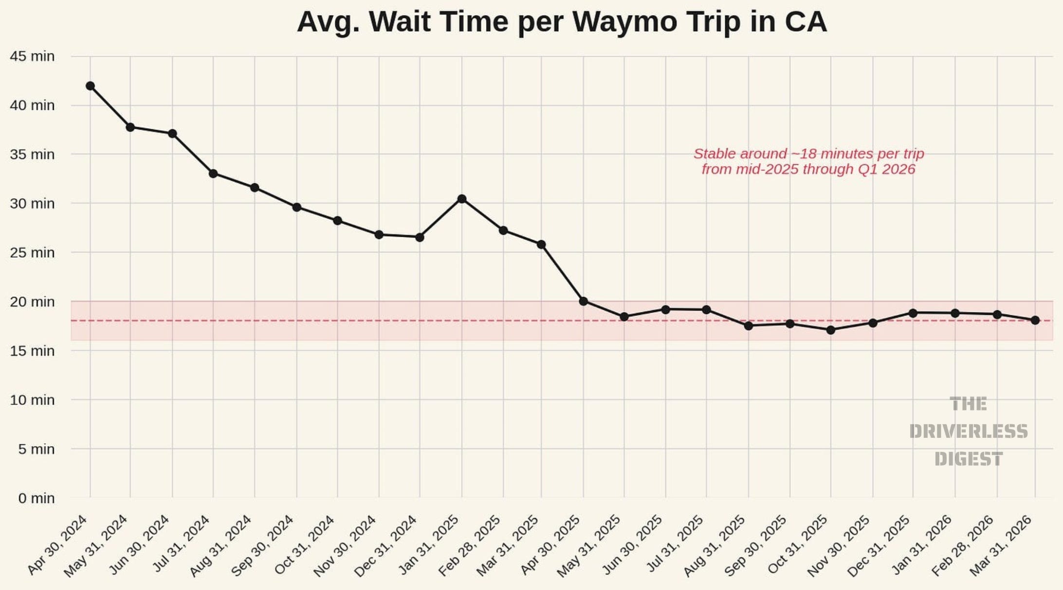
The natural question is whether Waymo is actively managing to that 18 minute number, or whether it just happens to be a product of where supply and demand have been intersecting. The data alone can’t fully distinguish those two stories.
The short of it: California growth is decelerating, but the conventional explanations for why don’t fit the data. At a time when Waymo is expanding nationally, it would be natural to think that this is a supply story. Maybe Waymo is reallocating resources elsewhere. I don’t think that is what is happening. If we piece together what public data is available on the size of the Waymo fleet, it seems to have kept growing through every disruption, from about 950 vehicles in June 2025 to around 2,000 by March 2026.
Wait times have been pinned at 18 minutes per trip every month since mid-2025, through the November peak, the December disruptions, and Q1 2026. If demand were outstripping supply, wait times would likely show an increase. If demand were collapsing, they would be shrinking all things equal. Now, we cannot tell if Waymo is actively managing demand to hit a ~18 minute level, but the wait time data certainly don’t suggest the exogenous shocks are shaking the wait time equilibrium.
Waymo trips are getting longer
What is changing is average trip length. Average rider miles per trip rose 45% since January 2024, with most of the gain in the last six months as freeway service and the airports came online. From November to March, trip counts grew about 7% while total rider miles delivered grew about 13%.
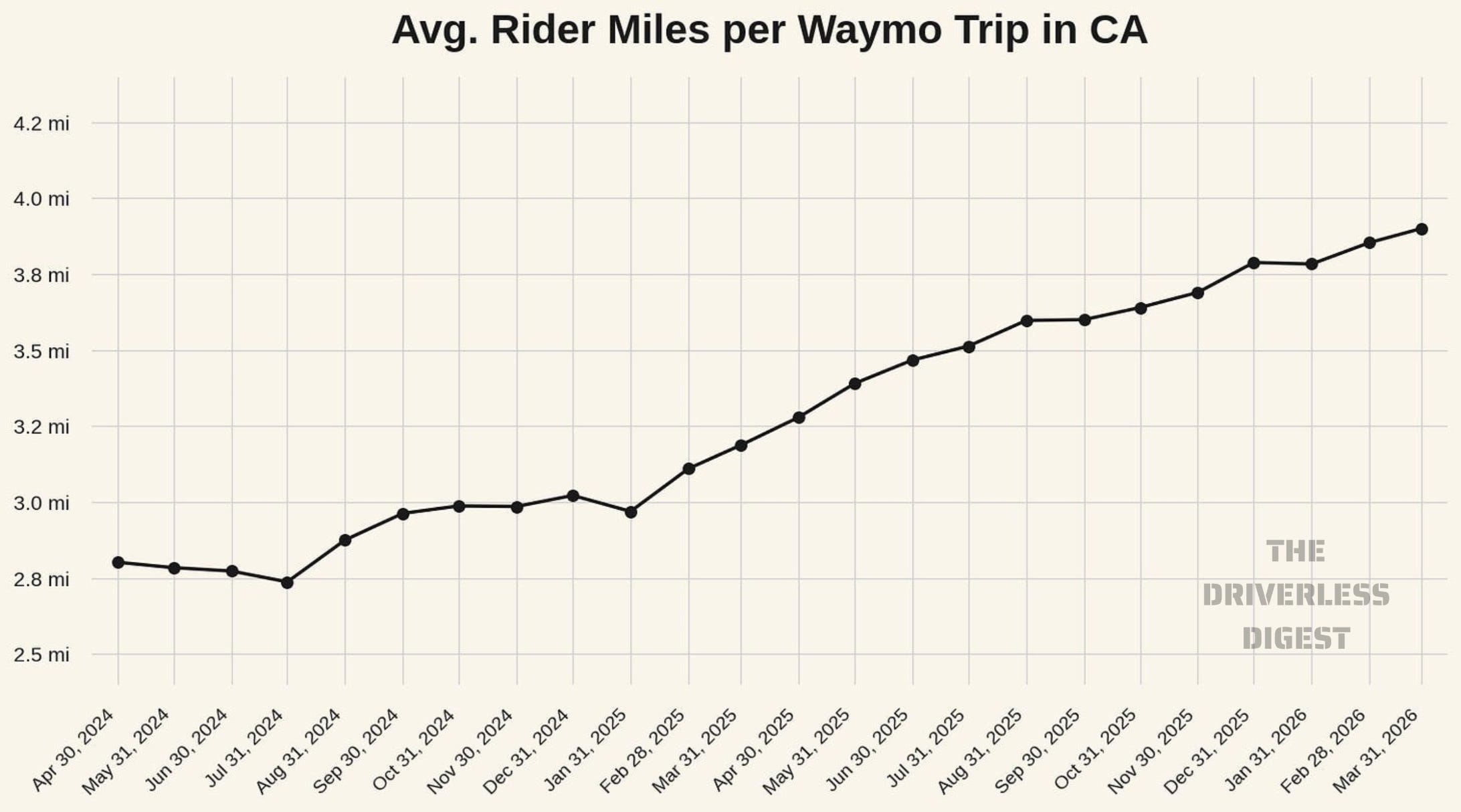
The trip length shift tells us something important about how Californians are using Waymo. In early 2024, when the service was almost entirely urban San Francisco, the average ride was under three miles, short, dense, urban trips. By March 2026, with freeway service open, SFO and SJC online, and the unified Bay Area zone in place, the average trip is 3.9 miles. People are taking airport runs, longer cross-city rides, and freeway routes that weren’t possible a year earlier. The mix is shifting from short urban hops toward something closer to a general-purpose mobility service.
This matters for the business model and for how we read the trip count signal. On the business side, longer trips with the same fleet might mean more revenue per car per day and more rider miles delivered per dollar of fleet capex. On the metrics side, it might explain why headline trip count is getting noisier as a signal of growth: from November to March. If you want to track Waymo’s actual California growth, rider miles will be increasingly important to examine alongside trip counts.
Waymo deadheading is decreasing
There is a second efficiency story running alongside the trip-length one. Passenger-occupied miles as a share of total vehicle miles climbed from 45 percent in April 2024 to roughly 58 percent by March 2026 (i.e. vehicle miles when the Waymo was notdeadheading). Most of the gain happened in the first year of the dataset, after which the service has stabilized in the 55 to 58 percent range. Idle miles, the share of vehicle miles spent between rides without a passenger or an assignment, fell from 39 percent to 27 percent over the same window. Pickup miles stayed roughly flat at 13 to 15 percent. So the fleet is doing longer trips on average and spending a smaller share of its miles empty.

What we can tell in May 2026
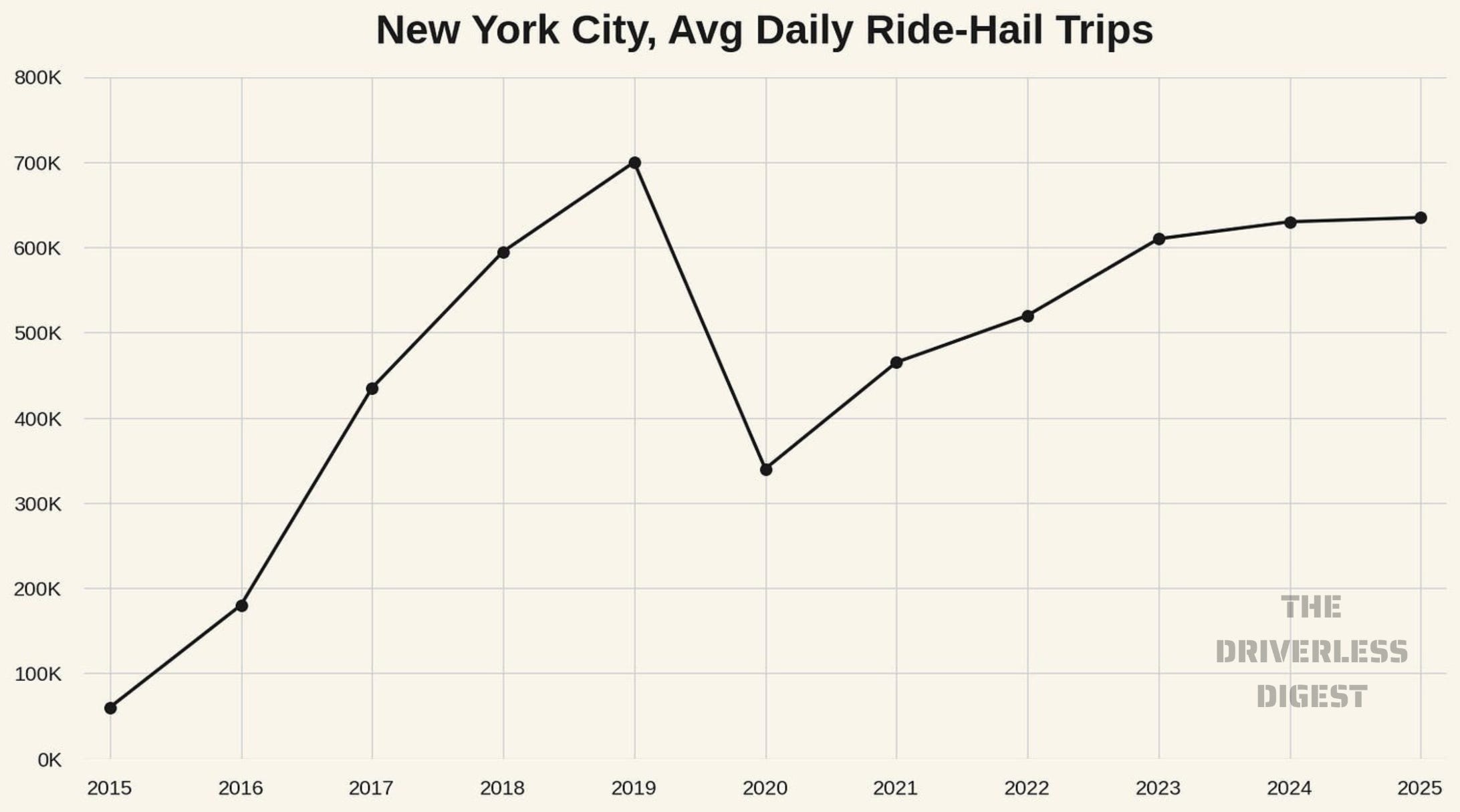
So, is Waymo’s California growth plateauing? Sort of. The underlying trajectory of trip count is genuinely decelerating. It is bending along a smooth S-curve, which is what services do as they mature. Perhaps the best corollary example of this is Uber and Lyft ride-hail trips. We can’t look at this in California, because the data is redacted, but New York City provides public data on TNC trips. In the chart below, ignoring the large COVID-19 drop in 2020-2023, there does appear to be a plateauing also occurring in ride hail trips in NYC after a period of rapid growth. Underneath the Waymo headline trip-count number, the more interesting story is operational: the fleet kept growing through every shock, wait times stayed pinned at 18 minutes, trips got 45 percent longer, and deadheading dropped 13 points.
Methods note. Monthly trip data is from CPUC’s Driverless Deployment quarterly filings, January 2024 through March 2026. The trajectory comes from an OLS regression of log(weekly trips) on a quartic polynomial in time, with HAC (Newey-West, 3 lags) standard errors. The regression is fit only on the 18 months that were not externally disrupted; the remaining 6 months of January and February 2025 (LA wildfires), June through August 2025 (ICE protests and recovery), and December 2025 (PG&E plus Christmas flood) are excluded from the fit and shown on the chart against where the trajectory predicts they should have been. The quartic captures both the rapid early growth and the smooth flattening into Q1 2026; cubic and quintic specifications were tested but quartic is statistically preferred (AIC -66.7 versus -44.4 for cubic and -64.8 for quintic). The trajectory implicitly includes the cumulative effect of all of Waymo’s expansion choices through the period (Peninsula in Aug 2024, Silicon Valley in Mar 2025, larger Peninsula push in Jun 2025, freeway plus SJC plus unified Bay zone in Nov 2025, SFO in Jan 2026), though with only 18 clean observations the model cannot separately identify each individual expansion’s contribution. Fleet anchors are Waymo public disclosures to TechCrunch, the SF Examiner, and Business Insider, interpolated log-linearly between dated anchors. Analysis supported by Claude AI.
 | A guest post by
|
As someone in Los Angeles who uses Waymo at least weekly, my experience is that pricing has become a bigger factor over the past few months. Rides that often used to cost me around $13-$17 before promotions are now regularly over $20. I enjoy using the service and would like to use it more, but at those prices I often choose to drive myself unless parking is difficult or I'm planning to drink.
If prices came back down, I could easily see myself using Waymo most days, potentially even for my daily commute. That makes me wonder how much pricing is affecting demand and ridership growth.
Coverage is another limitation. I would use Waymo more if it served destinations such as Woodland Hills, Pasadena, and LAX. If either my starting point or destination is outside the service area, the trip simply isn't an option.
The pickup and drop-off experience can also be frustrating at times. Waymo doesn't always allow the exact front entrance of a destination to be used, so pickups and drop-offs can end up down the street or even several blocks away. It's understandable that there are operational and safety reasons for some of these decisions, but it does add friction compared to driving yourself directly to the door.
Overall, I still like the service, but higher prices, service-area limitations, and pickup/drop-off constraints are the main reasons I don't use it more frequently.
Excellent post, Matt! Is it feasible to set up a self-updating database like Todd Schneider does for NYC ridehailing data: https://toddwschneider.com/dashboards/nyc-taxi-ridehailing-uber-lyft-data/